Company Project - Apr 2023
Redesigning Property Search

My Role
UI UX Designer
Team
Product Manager,
2 Engineers, 1 Designer
Timeline
4 Weeks
Skills
UX Audit, Redesign, UI System
Product Overview
Graana UX/UI Audit & Redesign
Redefining how users search, explore, and connect with real estate online.
Context
Graana is a leading real estate marketplace aiming to simplify property discovery for users in Pakistan.
Its online real-estate marketplace that lets users buy, rent, and invest in verified properties across cities we’re building a platform where finding your next home or investment isn’t bound by borders.
I collaborated on designing and developing multiple marketing landing pages creating smooth user experiences and visually compelling layouts. Build a consistent style system across website assets to reinforce design uniformity and scalability.
Problem
The existing digital experience lacked usability clarity, visual consistency, and flow efficiency, making it difficult for users to search, explore, and compare properties without friction.
Goal
To enhance usability, a unified design system, and create a cleaner, intuitive interface that improves discovery, shortlisting, and conversions across rent, buy, and sell journeys.
Design Process
My process around understanding first identifying what’s working, what’s not, and then shaping a clear direction before jumping into design.
Audit & Analyze
Conducted a heuristic review to identify key usability, accessibility, and visual consistency issues.
Define & Strategize
Grouped findings into key problem areas and set clear design goals focused on clarity, consistency, and efficiency.
Redesign & Systemize
Refined core flows and built a cohesive, scalable UI system ensuring a unified and accessible user experience.


Existing Design References
Identified Problems
Cluttered Visual Hierarchy
Core actions, filters, and content areas compete visually, leaving no clear path for the user’s eye. The lack of hierarchy causes confusion and slows down the decision-making process during property exploration.
Overwhelming Filter System
The search interface exposes too many filters upfront without logical grouping or prioritization. Instead of simplifying choices, it overwhelms users and makes narrowing results unnecessarily complex.
Inconsistent UI Behavior
Similar components behave differently across screens from button states to card layouts. This inconsistency creates friction, increases cognitive load, and weakens the overall product reliability.
Poor Spatial and Content Alignment
Uneven spacing, irregular grid alignment, and redundant information blocks disrupt rhythm and make the interface feel cluttered and unrefined, reducing both readability and perceived quality.

Design Solutions
To thoroughly understand the challenges within Graana’s website experience, I conducted a comprehensive UX assessment involving.
Unified Property Listing Card
A cleaner card layout highlights key details upfront, enabling faster scanning and selection.
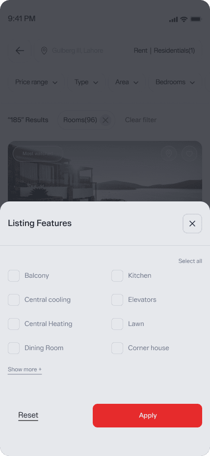
Persistent Search & Filter Controls
Always-visible controls simplify refinement and reduce repetitive navigation.
Synchronized Map–List Experience
Unified behavior ensures results update instantly across both views.
Quick Shortlist and Comparison Support
Lightweight tools support fast saving and side-by-side evaluation.
Improved Visual Hierarchy for Readability
Refined typography and spacing enhance clarity and reduce cognitive load.


Search and discoverability
Homepage



Search and discoverability

The Impact
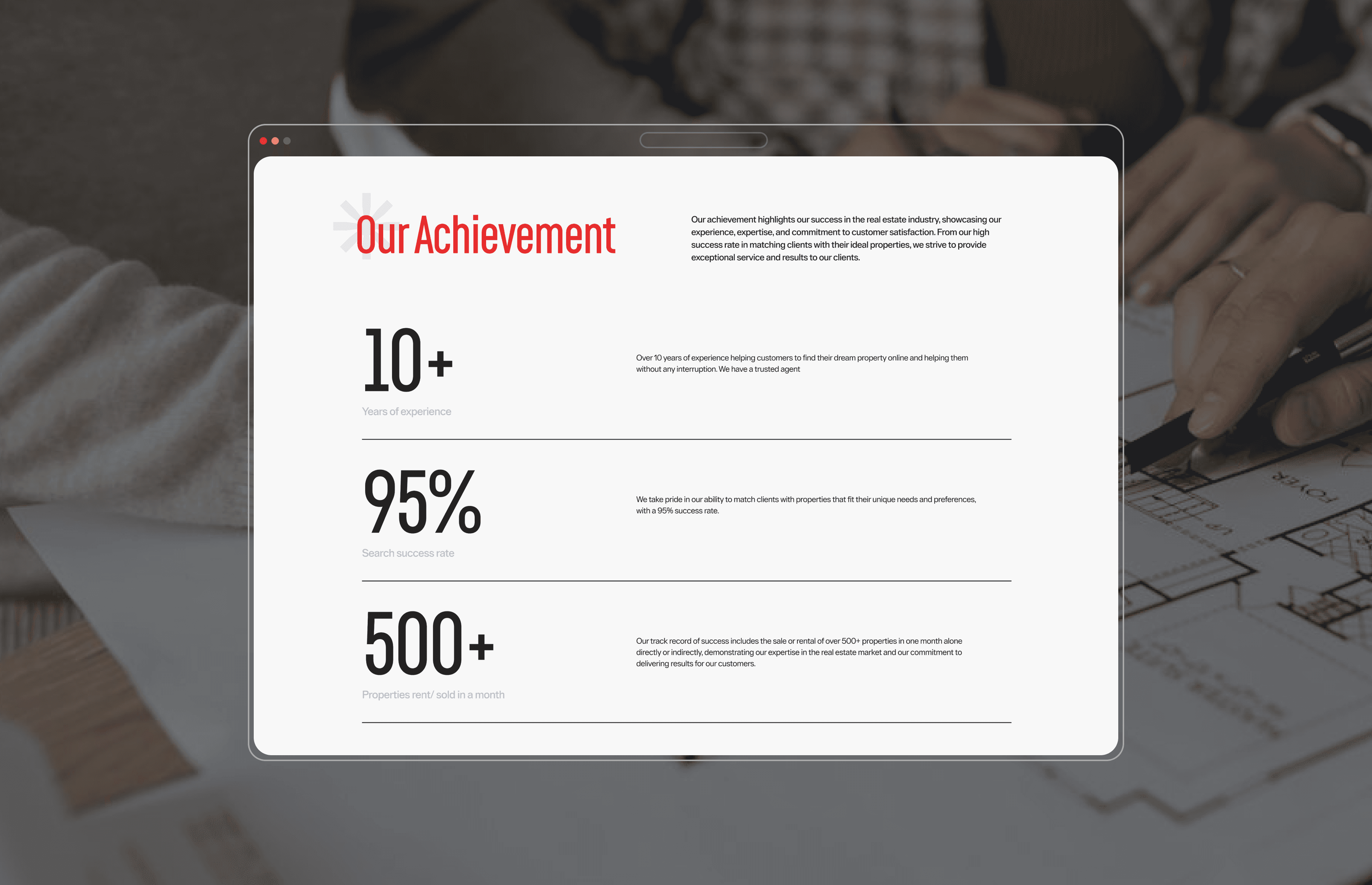
The audit and redesign established a clearer, more predictable journey for property seekers. By reducing cognitive load and strengthening hierarchy, the experience now supports faster decision-making and stronger conversion intent.
Result:
Higher clarity and trust through structured information
Improved visibility and flow
More consistent experience across the website
Reduced Cognitive Load

/Reach me
abakhsh56@gmail.com
/Navigate
/Stalk me out
Built with intention, one coffee at a time
© 2025 Allah Bakhsh
Back
Back